"In the follow-up to Anthem: Rush in the ’70s, Martin Popoff brings together canon analysis, cultural context, and extensive firsthand interviews to celebrate Geddy Lee, Alex Lifeson, and Neil Peart at the peak of their persuasive power. Rush was one of the most celebrated hard rock acts of the ’80s, and the second book of Popoff’s staggeringly comprehensive three-part series takes readers from Permanent Waves to Presto, while bringing new insight to Moving Pictures, their crowning glory. Limelight: Rush in the ’80s is a celebration of fame, of the pushback against that fame, of fortunes made ― and spent …
In the latter half of the decade, as Rush adopts keyboard technology and gets pert and poppy, there’s an uproar amongst diehards, but the band finds a whole new crop of listeners. Limelight charts a dizzying period in the band’s career, built of explosive excitement but also exhaustion, a state that would lead, as the ’90s dawned, to the band questioning everything they previously believed, and each member eying the oncoming decade with trepidation and suspicion."
Rush News from Power Windows...A Tribute To Rush
A Tribute To Rush
Rush News
Limelight: Rush in the ’80s (Rush Across the Decades #2) by Martin Popoff Now Available
Limelight: Rush in the ’80s (Rush Across the Decades) , book two in the three part Rush biography collection by Martin Popoff, is set for release on October 13th, 2020 from ECW Press. Preorder the hardcover edition at Amazon.
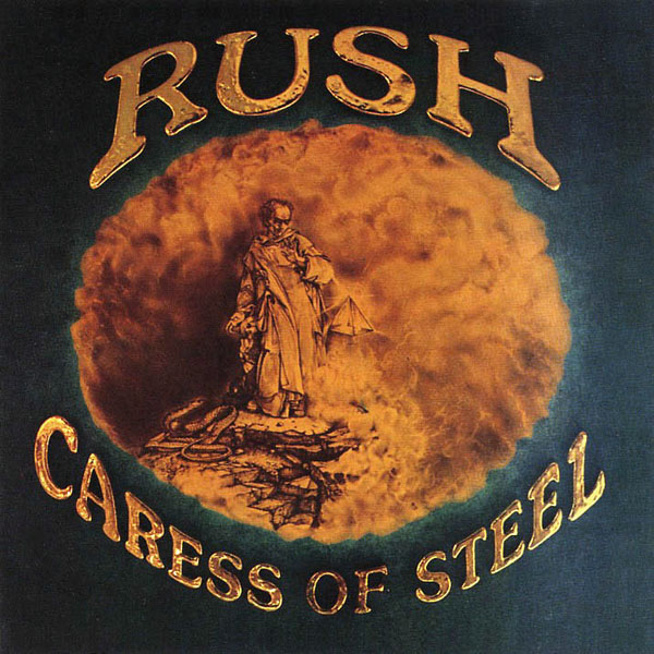
"Why Rush’s Record Label Changed the ‘Caress of Steel’ Cover Art" - Ultimate Classic Rock
Today UCR.com have posted a new interview with Rush art director Hugh Syme, where he talks about the Caress of Steel Album cover.
Read More: Why Rush's Record Label Changed the 'Caress of Steel' Cover Art | https://ultimateclassicrock.com/rush-caress-of-steel-album-art/?utm_source=tsmclip&utm_medium=referral
"I was a huge [M.C. Escher] fan. My original drawings were in pencil: clean, monochromatic, simple homages to Escher. But when the record label got ahold of these, they thought it wasn't rock and roll enough, so they added this chromium lettering and swung the tint of the whole image over to a brown sepia tone — none of which was requested or under my purview at the time. When the band said, 'What happened?,' I said, 'I don't know,'" he adds. "That began the premise that they would consider most A&R people attending their sessions — and, more so, their comments — as unwelcome. Because they weren't interested. And when they realized that other people were meddling in the process when it came to my art, they said, 'Don't listen to anyone. We're talking to you directly.' That set up a feature in my life. That album worked out well. I don't look back fondly on the outcome, but that's OK," he says. "It was more just me being indulgent — art directors are pretty selfish. We do what we want to do, and what a gift it was to work with a band like Rush. They — excuse the quote — allowed that deviation from any norms because that's what they aspired to do themselves as artists."
Read More: Why Rush's Record Label Changed the 'Caress of Steel' Cover Art | https://ultimateclassicrock.com/rush-caress-of-steel-album-art/?utm_source=tsmclip&utm_medium=referral
Subscribe to:
Comments (Atom)


