
 Home
Home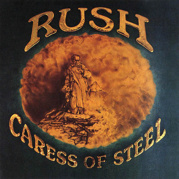
"I was a huge [M.C. Escher] fan. My original drawings were in pencil: clean, monochromatic, simple homages to Escher. But when the record label got ahold of these, they thought it wasn't rock and roll enough, so they added this chromium lettering and swung the tint of the whole image over to a brown sepia tone — none of which was requested or under my purview at the time. When the band said, 'What happened?,' I said, 'I don't know,'" he adds. "That began the premise that they would consider most A&R people attending their sessions — and, more so, their comments — as unwelcome. Because they weren't interested. And when they realized that other people were meddling in the process when it came to my art, they said, 'Don't listen to anyone. We're talking to you directly.' That set up a feature in my life. That album worked out well. I don't look back fondly on the outcome, but that's OK," he says. "It was more just me being indulgent — art directors are pretty selfish. We do what we want to do, and what a gift it was to work with a band like Rush. They — excuse the quote — allowed that deviation from any norms because that's what they aspired to do themselves as artists."
Read More: Why Rush's Record Label Changed the 'Caress of Steel' Cover Art | https://ultimateclassicrock.com/rush-caress-of-steel-album-art/?utm_source=tsmclip&utm_medium=referral
A very nice article, but what was “Caress of Steel” SUPPOSED to look like, any images?
ReplyDeleteThis comment has been removed by the author.
ReplyDeletehttp://bravewords.com/medias-static/images/news/2016%20II/Rushcaress.jpg
ReplyDelete